
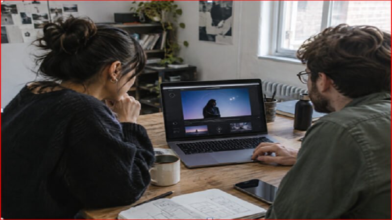
Motion-rich design can make a digital experience feel more tangible, explain complex ideas, and create a memorable visual identity. Galleries of 3D websites show how depth, scrolling effects, and interactive scenes can add character, but the strongest examples still make the core message easy to find.
The goal is not to remove movement from the web. It is to use it with intention. A site should remain quick to load, easy to navigate, and understandable whether a visitor has a powerful desktop computer, an older phone, a slow connection, or prefers less animation.
Table of Contents
- Why Motion Needs a Clear Job
- Where Depth and Movement Work Best
- How to Protect Page Performance
- How to Make Motion More Accessible
- What Changes on Mobile Devices
- Why Fallbacks Matter
- A Practical Workflow for Teams
- What to Test Before Launch
- Common Mistakes to Avoid
- Final Checklist
Why Motion Needs a Clear Job
Every movement should answer a user question. A transition can confirm that a menu opened. A product rotation can reveal a feature. A subtle change in opacity can direct attention toward the next step. When an effect does none of these things, it can become a delay between the visitor and the information they came to find.
Before adding animation, define its purpose in one sentence. If the team cannot explain what it helps a person notice, understand, or do, it is probably decoration rather than a useful interface element.
Where Depth and Movement Work Best
Depth and motion are especially useful when they reduce the effort needed to understand something. They can support product demonstrations, educational explainers, interactive maps, portfolio work, and step-by-step visual stories.
Strong Use Cases
- Showing how physical parts fit together or move.
- Helping visitors compare product options.
- Revealing information in a deliberate sequence.
- Creating a visual path through a long or complex page.
A dramatic hero scene may attract attention, but it should not hide the headline, the primary action, or the value of the page. Let content lead and let visual effects reinforce it.
How to Protect Page Performance
Large media files, detailed 3D models, third-party scripts, and continuous animation can increase the work a browser must do. Build the page so that its text, navigation, and primary action are available before optional visual layers are ready.
Performance Practices to Use
- Compress images, video, textures, and model assets before publishing.
- Load complex visuals as they approach the viewport, rather than immediately.
- Serve smaller assets to smaller screens when possible.
- Prefer animations based on transform and opacity when they achieve the desired result.
- Remove scripts and libraries that are not needed in production.
- Stop offscreen animations that no longer contribute to the task.
Performance is a design constraint, not a final cleanup task. A lightweight visual cue that appears promptly is generally more useful than an elaborate scene that delays the visitor.
How to Make Motion More Accessible
Some forms of movement can distract users, interfere with reading, or cause discomfort. The prefers-reduced-motion media feature lets a site detect when a visitor has asked their device to minimize nonessential animation. Treat that setting as a meaningful preference, not a minor visual variation.
Provide the same information without requiring animation. If a diagram spins to reveal labels, offer those labels in nearby text. If a scene depends on drag or hover, provide clear buttons or another direct method to reach the content.
- Use a reduced-motion version that removes or simplifies large movement.
- Give autoplaying content a visible pause or stop control.
- Avoid flashing and rapid visual changes.
- Keep keyboard focus visible and controls reachable by keyboard.
For automatically moving content, pause, stop, or hide controls should be straightforward to locate and operate, especially when the animation lasts longer than a brief transition.
What Changes on Mobile Devices?
Mobile design needs more than a smaller layout. Phones have limited screen space, may be used on variable connections, and do not offer hover as a reliable interaction. Test whether the experience remains clear in portrait orientation, whether touch targets are comfortable to use, and whether the primary content works before a heavy visual asset loads.
Why Fallbacks Matter
A fallback is a planned alternative, not a failed version of the site. It can be a static image with descriptive text, a captioned video with controls, a simple two-dimensional interface, a product gallery, or a text explanation. Each option should preserve the key message and action.
A Practical Workflow for Teams
- Define the user goal. Identify the action or understanding the page must support.
- Build the content structure first. Ensure the page makes sense without motion.
- Choose the smallest useful effect. Start with a clear cue rather than a full scene.
- Create reduced-motion and fallback versions. Plan them alongside the primary concept.
- Test on real devices and connections. Include lower-powered phones as well as desktop systems.
What to Test Before Launch
Review loading behavior, interaction responsiveness, layout stability, and how the page behaves on mobile networks. Then test keyboard-only navigation, screen reader access, text zoom, visible focus states, and reduced-motion settings. Finally, watch people attempt a real task. A polished animation can still fail if users do not know where to tap, what changed, or how to proceed.
Common Mistakes to Avoid
- Adding movement to every part of the page.
- Making visitors wait for an animated hero before showing the message.
- Hiding essential information inside an interactive scene.
- Using autoplay with no practical controls.
- Testing only on a fast desktop computer.
- Using motion to compensate for unclear content or navigation.
Final Checklist
- Does every effect serve a clear purpose?
- Can visitors understand the page without animation?
- Is the main content available quickly?
- Can people reduce, pause, or stop motion?
- Does the experience work well on mobile?
- Is there a useful fallback for less capable devices?
Motion-rich websites do not have to choose between visual ambition and responsible design. The best experiences use movement with restraint, protect the essential content, and give every visitor a clear path to the same information.
See More